Mindy Design, Beauty Salon Booking App – Case Study
PERSONAL PROJECT
Brief
In a context of pandemic and isolation that has harmed many businesses, Mindy proposes a technology-based solution. Not only does it allow users to arrange appointments with beauty salons without losing precious time, but it also gives businesses visibility in their specific niche. This enables them to maintain a database, as well as a digital schedule.
UX/UI Design Course Project
March 2020 – August 2020
📍 Argentina
As a student of UI/UX Design, I took charge of absolutely everything: from research to wireframes.
- Figma
- Adobe Photoshop
- Adobe Illustrator
The problem
What do we want to solve?
Health and Beauty salon industry is growing exponentially. But with the rapid growth in this industry, customers face many problems, such as:
- Customers cannot find or may not be aware of nearby salons.
- The services each salon provides may be different. There is no way to know them.
- The pricing of each service may vary according to the salon. The customer cannot find or know them before reaching the salon.
- The customer has to wait in line for their turn, which may lead to wastage of time.
Problem statement:
"People find it difficult to find beauty salons, get to know them, compare them and book appointments, due to poor digitisation of processes."
The solution
How are we going to solve it?
Addressing all the problems, solutions were found for them.
- Based on the location selected, the customer can find the list of salons near them.
- Each salon lists the service they provide, along with details of the service and time by each of them. This allows users to choose their preferred service.
- The pricing is also displayed along with each service. This avoids any unnecessary surprises at the last minute.
- Booking a slot for the desired salon will solve the problem where customers have to wait in line.
Goals
What are we trying to achieve?
UX Objective:
Connect beauty professionals and their potential customers through a trusted platform.
Business objective:
Reach 300 booked appointments during the first 3 months.
Business model
Generate a small profit as a commission from each booking. Additionally, while listing salons, they can promote themselves for a small price. This will generate an income for Mindy and the promoted salons can have a hike in customers, which will, in turn, improve their business.
The design thinking process
Empathise
Looking for insights
The focus of this research was to explore opportunities in digital products for booking beauty professionals. I also wanted to discover the factors that may discourage potential users from using an online booking platform for their salon appointments.
Online Surveys
Knowing the users
A total of 30 individuals took part in the survey. The target audience was people aged between 20–40 years. The target audience was mostly single mothers and women with small kids, working professionals, and students.
Interview Questions
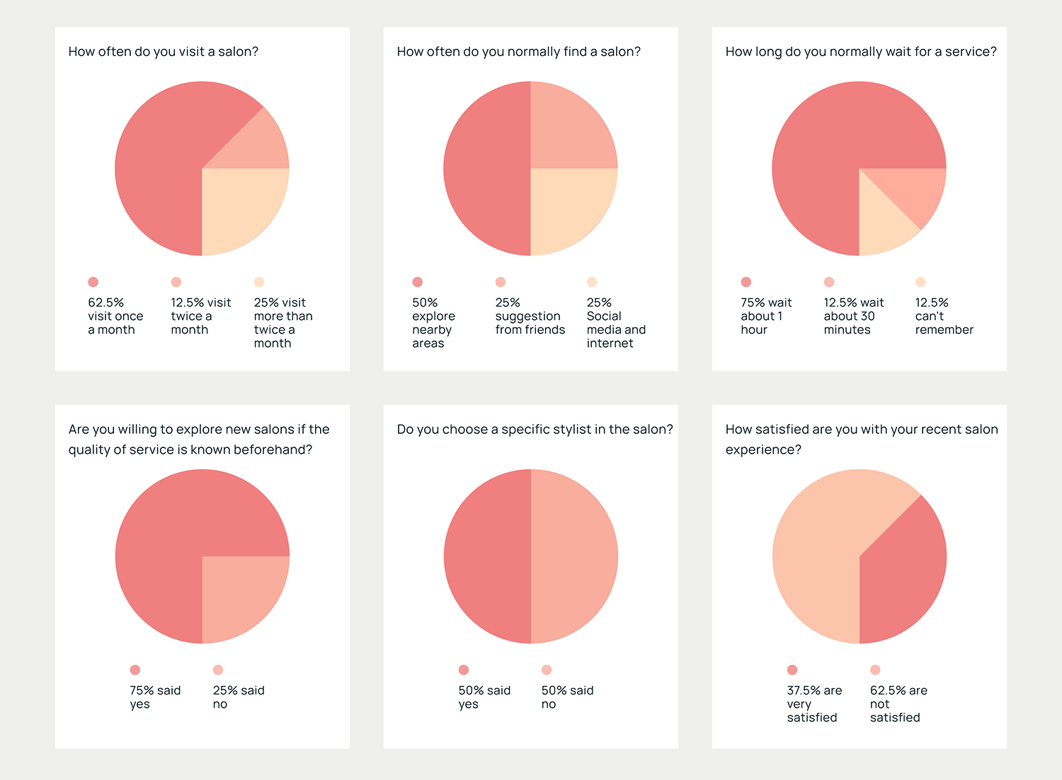
- How often do you go to the salon?
- How do you normally find a salon?
- How long do you usually wait for your turn?
- Are you willing to explore new salons if the quality of service is known beforehand?
- Do you choose a specific stylist in the salon?
- How satisfied are you with your recent salon experience?
Understanding the users
I conducted in-depth user interviews with 8 potential users on how there salon experience was each time right from beginning to the end. These interviews provided a better-detailed understanding of the frustrations and pain points and also what they like and dislike about the existing method of salon booking.
Interview Questions
- What is essential for an app for booking beauty appointments? Objective: to understand the user's needs
- How do users book salon appointments? Objective: To understand user behaviour
- Do users need a mobile app for booking their salon appointments?
- How do users feel about existing means of booking appointments online?
Insights from Interviews
After speaking to the users many things came to light. Many details got highlighted about their experience starting from searching for salons to payment.
🔍 Difficulty finding a suitable salon nearby.
⏱️ Physically exploring nearby areas for salons takes a lot of time.
🧍🏻♀️ Waiting in a long queue and wasting lots of time to get service done.
⭐ Unsure about salon service quality due to Lack of proper salon ratings and reviews.
💇🏼♀️ Unable to book a specific stylist.
👛 Limited knowledge about offers in salons.
💳 Unable to pay online, have to wait after service before payment.
📆 Forget about the appointment sometimes, no reminder..
Define
From the insights of the research, I identified opportunities to build a product with a focus on discovering beauty professionals close to users’ location and building the users’ trust by providing only verified reviews.
Describing the problem (POV)
- An young woman who works full time needs access to a salon nearby because she wants to look good and doesn't have much time.
- A working mom who only has time for herself during the weekend needs to book a slot for her appointment as she usually gets frustrated with the long queues in the salon.
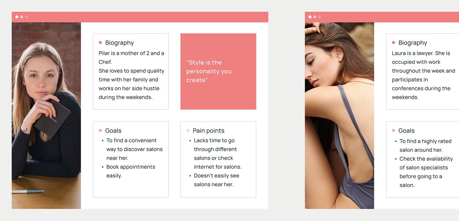
User personas
To empathize more with the users and try to find a solution to their problems, I made two personas. The personas helped me to prioritize the type of users and gave a clear idea to execute combined solutions to their problems.
Ideate
Feature ideation
Once I had empathised with the users and defined the problem, I moved on to the next step: the feature ideation process. To transform problems into opportunities and stimulate brainstorming, I used the technique "How might we?”
So:
“How might we create a product that users can trust for booking their beauty appointments in their location”.
Keeping user insights and all the research in mind, I came up with a list of features that can help the users a seamless flow of the whole experience.
📍 Discover a salon nearby.
👛 Ongoing offers.
💬 Customer ratings and reviews.
⏰ Reschedule appointment through booking history.
💲 View pricing and service details for each salon.
📆 Secure an appointment at your own convenient time.
🔔 Get reminders of your bookings.
💳 Online payment option.
⭐ Save favorite salon.
Design
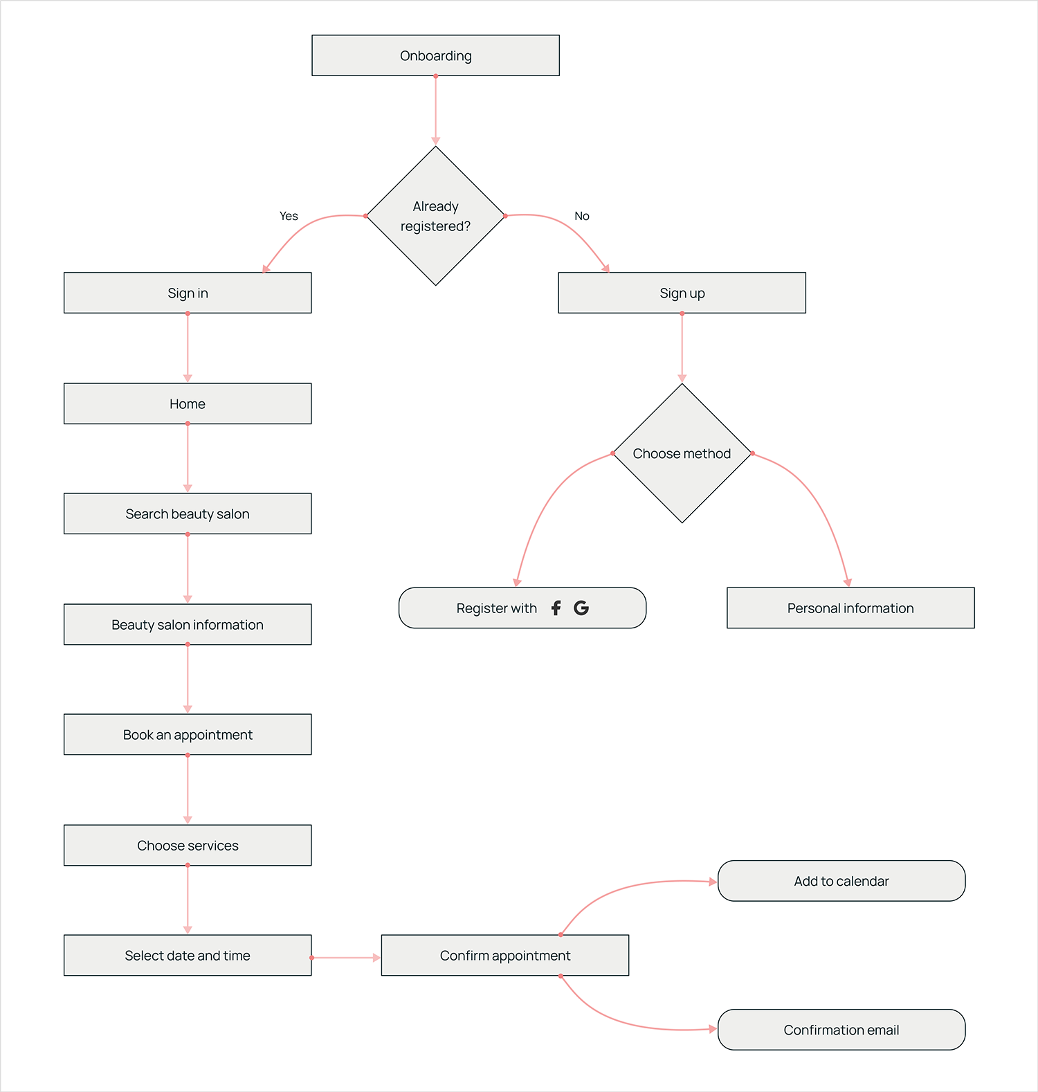
Creating the user flow
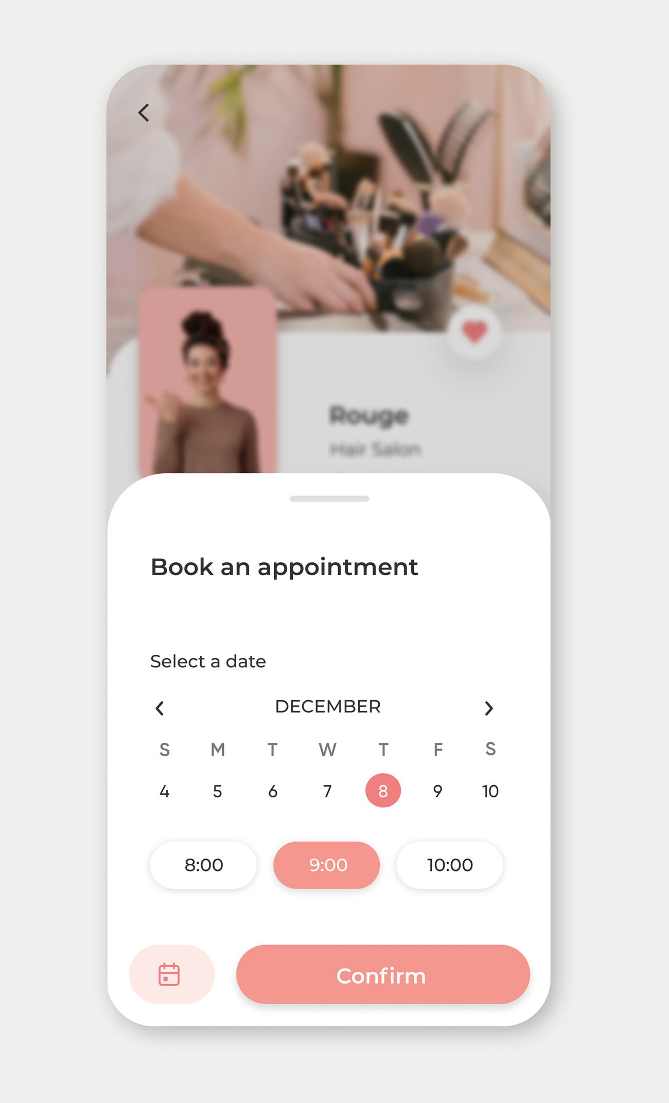
I focused on creating the user flow mainly on selecting a service and booking an appointment at a salon, since that is the major function of Mindy.
From wireframes to a prototype
I tried out different solutions and came up with the low fidelity wireframes and tested them with the potential users. These initial sketches helped to filter out some of the critical and also obvious problems that the users face, liked or disliked.
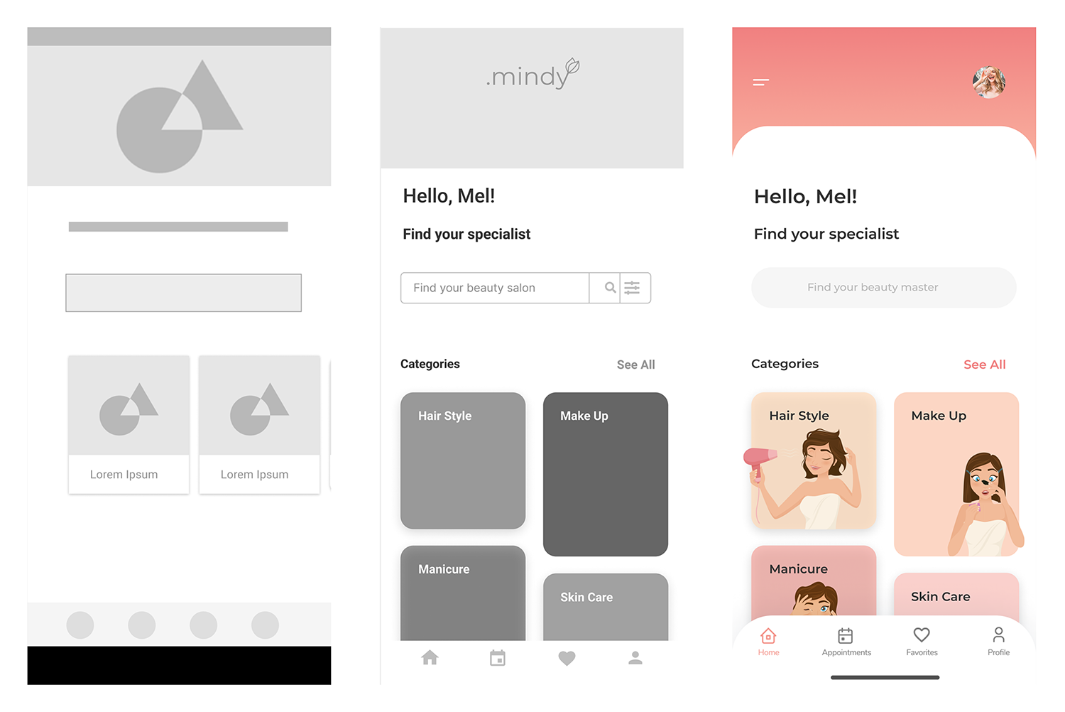
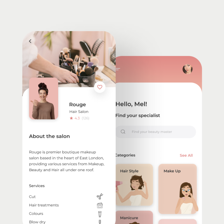
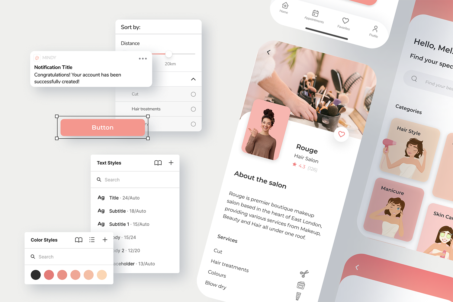
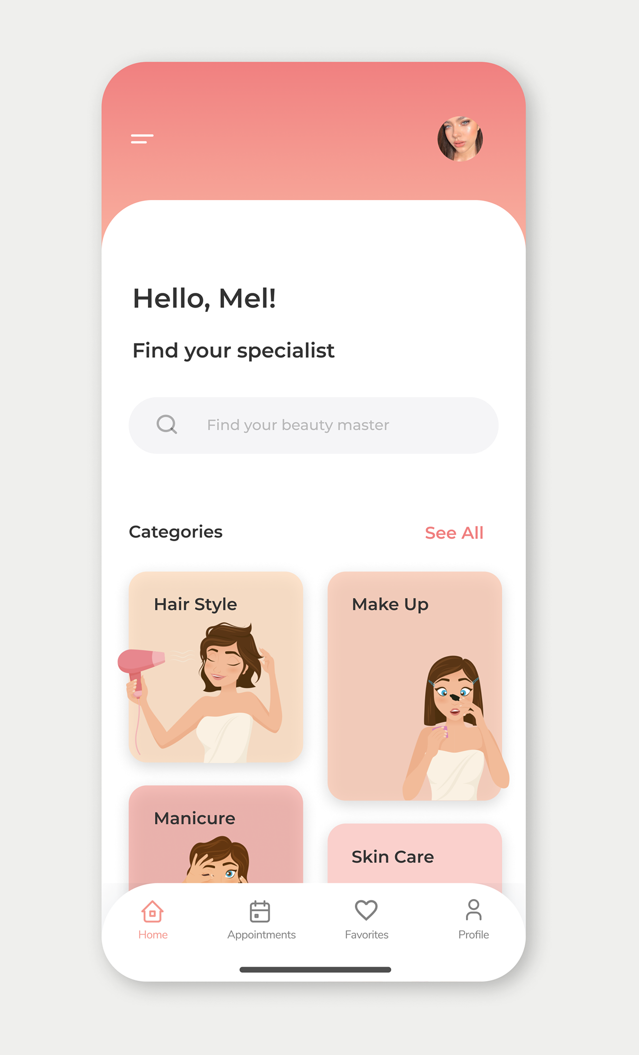
UI: Visual design
I created a style guide to keep the UI consistent (colors, fonts, structure, basic components, etc)
Test
Conducting a remote usability test
I decided to make a quick prototype to validate the usability and overall value of solution design.
The objective of the test was to identify:
- How users navigate through the app
- How do users find the desired salon
- How users select a service, select available and desired slot, and proceed to checkout.
- How users checkout
- Identify errors while performing the task
These were the results:
- 90% of participants were able to successfully complete all tasks
- 1:16 Average time on task
- 8 Average number of clicks
Iterating the prototype
Working with data collected during the test stage, I was able to set up a UX backlog with improvement opportunities which we reviewed with my tutor.
Some of them were:
Improving the CTAs
A Call to Action was needed to tell the user what they were supposed to do. So I added a clear CTA: "Find a professional". I also added shortcuts and anchored the main search engine to the screen.
Reducing the steps
✏️ It took a long time for the user to finish the task (booking an appointment) due to the number of steps he had to do, so I decided to optimize the process and reduce it from 3 screens to 1 to reduce the effort.
Highlighting the main task
✏️ Users had to scroll to the bottom of the screen to find the "book an appointment" button, which was inconvenient and impractical as it took longer than necessary. Sometimes, they felt frustrated with the lack of visibility of the CTA.

Retrospective
Final conclusions
Thanks to feedback from users and design experts (my teacher and my course tutor), I managed to design a solution that solves the user's problem when faced with the main task: finding a beauty salon nearby.
Designing this product was an exciting experience. I followed an end-to-end design process. I went from user research to research synthesis, ideating, prioritizing ideas, building prototypes, testing, and iterating my designs.
I learned a lot about the Design Thinking methodology, the importance of creating a useful product that really solves a real problem and other factors that impact the experience: highlighting the main action using clear and intuitive CTA's, resolving the flow in as few steps as possible and hierarchising the information to improve the findability of the elements. I will definitely apply these learnings in my next project.
Play around with Mindy’s prototype