
Nielsen’s Ten Usability Heuristics: Which are the general rules to consider to create an accessible and usable interface?
Today we are discussing heuristics, but what are they exactly?
Usability rules, principles, or heuristics are a series of principles described by Jakob Nielsen, considered the father of usability. It turns out that in the 90s, theorists like Nielsen and Roff Molich started studying the relationship between people and systems. That is how the heuristic assessment was born. It is a methodology used to analyse and improve the interaction between human beings and software.
After twenty years of its creation, these heuristics continue to be as active as in the beginning, and they are still a sacred manifest to user experience designers not only to analyse, but also to create digital user-centric products.
1. Visibility of System State
This first heuristic states that the design should always keep users informed about what is going on, through appropriate feedback within a reasonable amount of time. This practice allows users to control their decisions, reach their goals, and trust the brand.
For example:
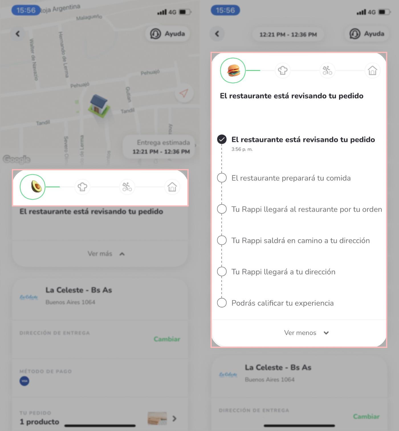
- Rappi applies this principle when it shows the exact phase of our order. Also, when a platform shows us progress indicators when creating an account (e.g., “you have completed 70% of your profile”), or when a site confirms that it has processed an action that we made.
How necessary is this heuristic? A lot. To have an idea of how frustrating and ambiguous the world would be if the systems we use did not apply this principle. For example: Let’s imagine that home banking apps did not indicate “wire transfer completed” when we do a wire transfer, and it simply returned to the home page. That is all, no confirmation message, no green tick. How would we feel? Lost and worried, for sure. Was the wire transfer successful? How do I know if the recipient received it? Was my money deducted? Do I have to do it again?
2. Match between system and the real world
This second heuristic states that the design should speak the users' language and use words, phrases, and concepts familiar to the user. It is a fact that people build mental models of how things and theories work based on past experiences with real objects. Our brain is constantly reusing information previously acquired to apply it in the present, solve new situations, and understand elements of reality that we face for the first time.
There are two examples in terms of interfaces:
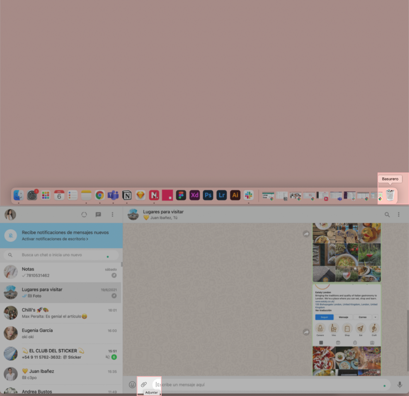
- The Mac and Windows “recycling bin” share the same shape as a real-life rubbish bin.
- The “attach file” icon refers to the “clip” object that works in the same way in real life, which is to group or attach sheets of paper. This symbol works globally, but we will leave universal iconography to another article.
3. User control and freedom
To ensure users’ freedom and control when using a product, they should be able to easily abandon a task, go back a step, and undo a change they have made. Exits allow users to remain in control of the system and avoid getting stuck and feeling frustrated.
The third heuristic states that we need to include the following:
- A link to take us “back” to return to a page or previous screen.
- A link to let us “cancel” to abandon a task.
- A link to “close” the current window to close a pop-up window.
- Una opción de “deshacer” y “rehacer”, para retroceder un cambio que hicimos en la interfaz.3.
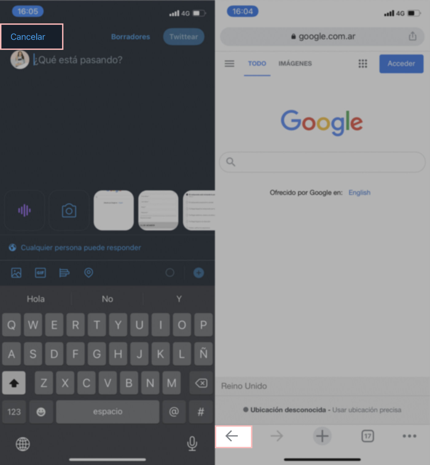
Once again, we can establish an analogy between these exits in UI and exits in real life. If we enter a place and we regret it, we can turn around and go back. If we are trying to call a lift and we regret it, we can cancel the task, and the list goes on and on.
4. Consistency and standards
Users should not have to wonder whether different words, situations, or actions mean the same thing. This heuristic teaches us that it is advisable to follow industry conventions and the same internal brand conventions, conventions that are maintained (or should be maintained) in their various products.
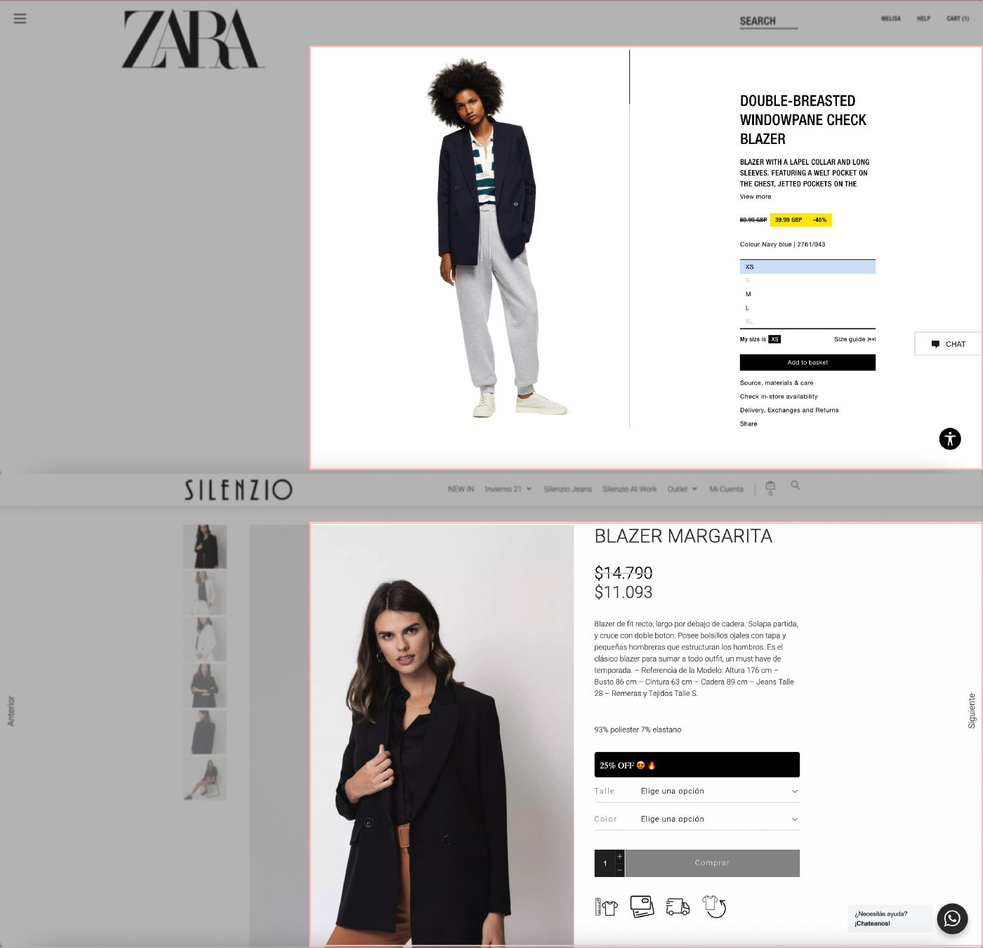
- A clear example of industry consistency is the design and the location of the shopping cart on e-commerce sites. The shopping cart is always in the upper right corner, and it always has a similar design, despite the branch of the online store we are visiting. There is not a clearer definition of following a standard.
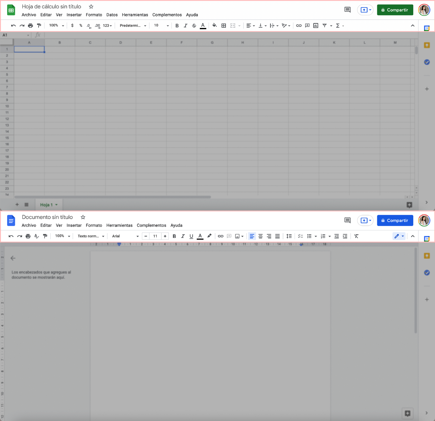
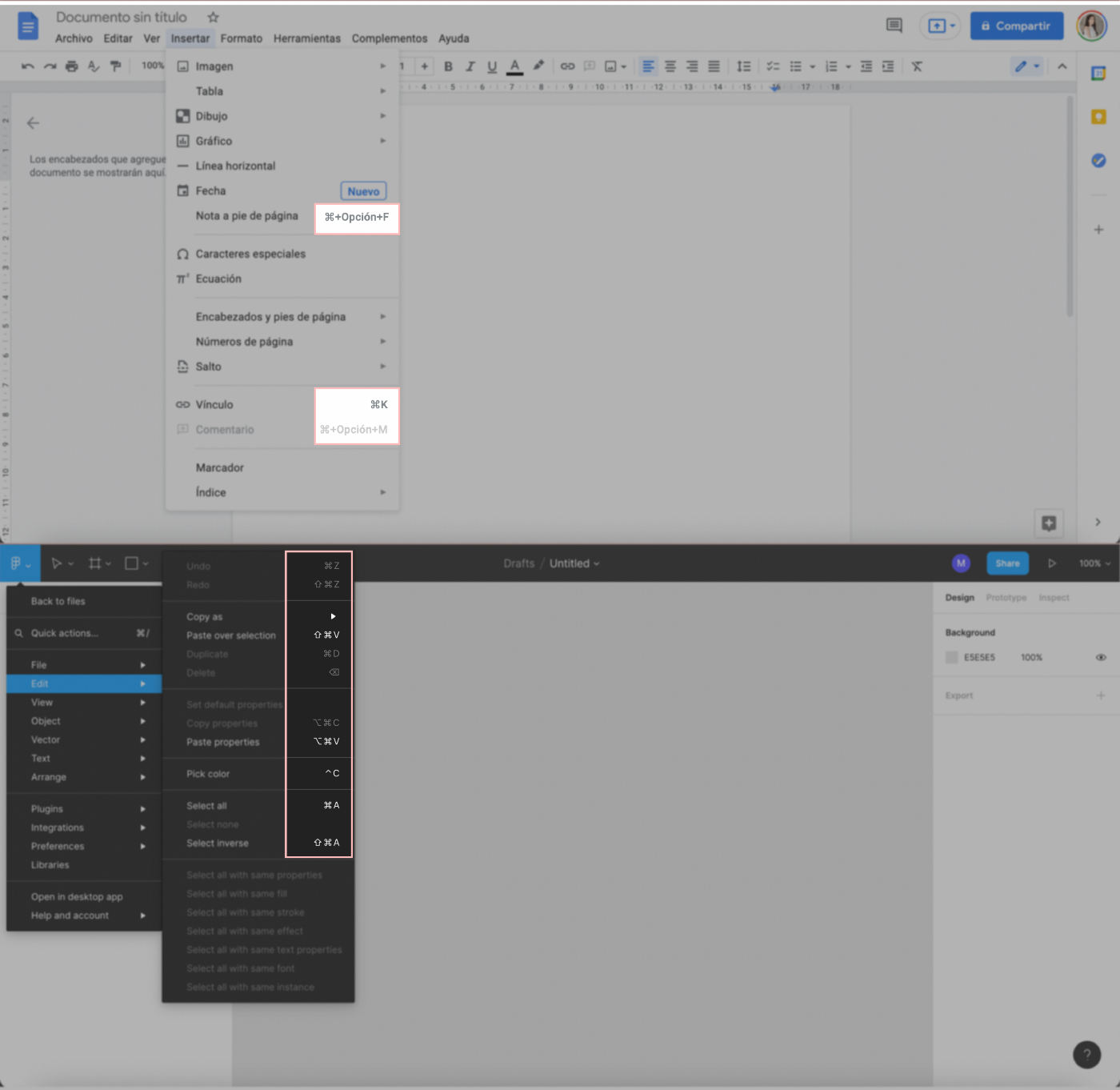
- When it comes to internal consistency, we play safe: Google. Google has the same toolbar in its whole product line. No matter if we are working on Google slides, sheets, or docs, the upper toolbar reads in this order: “File, Edit, View, Insert, Format...” Icons are the same, they are positioned in the same order.
Therefore, if we know how to use one, we know how to use them all. If we are a bit experienced in web surfing, then we can easily recognize repeated elements and meanings. This allows us to make a less cognitive effort.
5. Error Prevention
Good error messages are important, but the best designs carefully prevent problems from occurring in the first place.
When we are mapping the journey users will do on the interface to accomplish a task, we think users go from A to B. As in any journey, journeys have obstacles and problems.
There are two types of errors:
- Slips are unconscious errors caused by distractions. Users, like any human being, are not perfect.
- Y los errores como tal, que son causados por un desajuste entre el modelo mental del usuario y el diseño. Recordá que hablamos de mapas mentales y representaciones de la realidad en la segunda heurística.
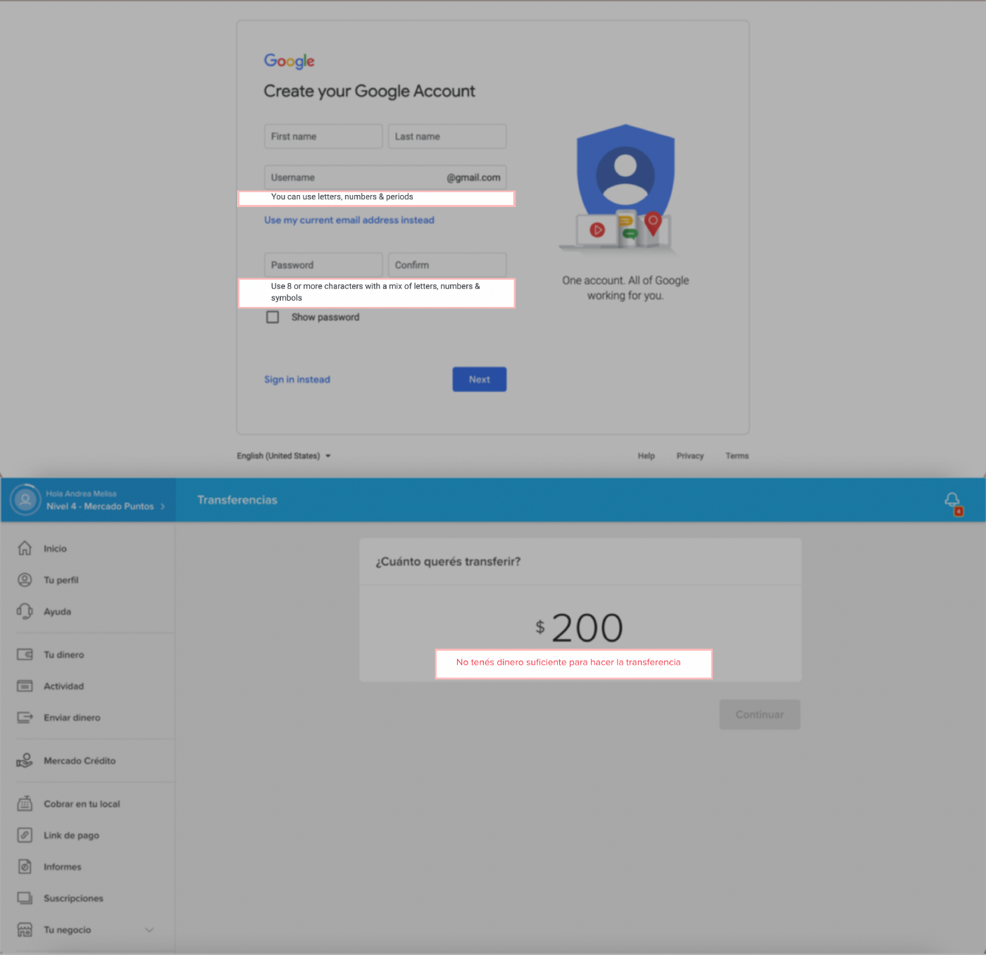
Let’s set an example: When we create or reset a password for the very first time and it does not follow the safety standards requested by the system, the platform tells us which request is missing or wrong before pressing “Confirm” than after.
6. Recognition rather than recall
This heuristic states that the user should not remember information from one part of the interface. Users do not need to make such a mental effort (yes, we are talking about cognitive activities once again.) We are saving memory charge to our users when the design provides “recognisable” information rather than “retrievable”.
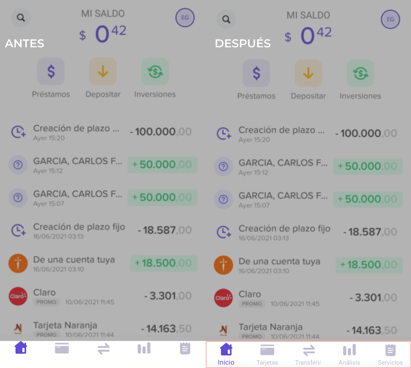
I love this example. The company Brubank, a 100% digital Argentine bank applied this principle not so long ago. Before this change, the button apps were not described, they were just present in icons. It was awfully hard to remember the meaning of each one. You ended up clicking the wrong button, which led somewhere you did not want to go. It was very annoying, to be honest. Luckily, the UX team included this simple and functional UI copy. It was as simple as describing the meaning of each icon. A minor change makes all the difference. This proves that content is king.
7. Flexibility and Efficiency of Use
We design thinking that our users are beginners and lack experience with the product. That is correct, but what about those who are experienced?
This principle indicates that we need to satisfy experienced users as well, so that they are comfortable navigating the interface.
Experienced and inexperienced users do not have the same needs. Accelerators (like smartphones keyboards that allow us to type without lifting our finger), and shortcuts (like the famous ctrl +c and ctrl +v) can make interaction a lot quicker and more fluid.
8. Aesthetic and minimalist design
Interfaces should not contain information that is irrelevant or rarely needed. Unnecessary elements may distract users from their goals, and complicate access to information, which is what they really need.
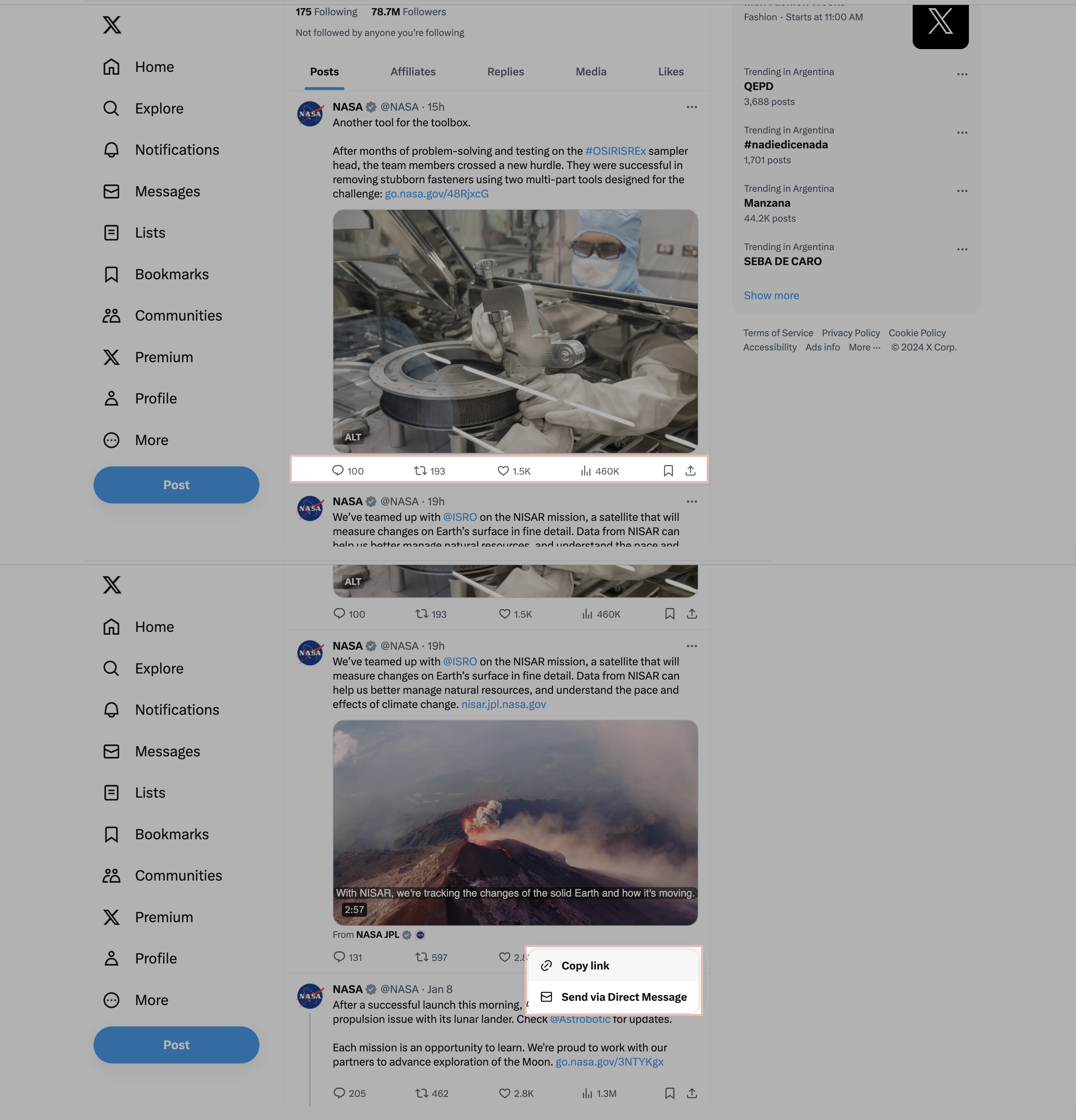
For example: On the social network X/Twitter (in all its versions), each tweet has 4 available actions: comment, retweet, like, and share. Only when we select "share" do all the other options related to the share button appear: send via direct message. Can you imagine how uncomfortable it would be to have all the options together?
9. Help users recover from errors
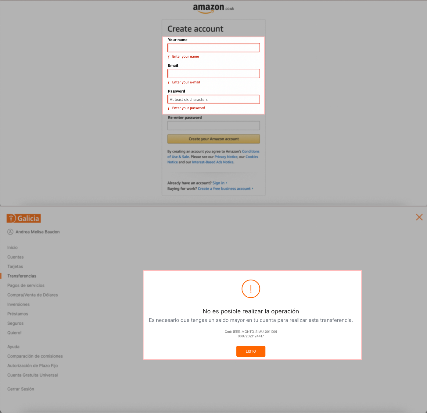
Error messages should be expressed in plain human language. The classic non-explicative and useless “error 404” is over. We need to design these messages in a way that they inform what caused the problem, what are the consequences or what actions the user will not be able to make, how to get out of there, and how to correct it.
It is not the same to say “Rejected Purchase” than
- “Purchase rejected by VISA. The credit card has not been authorised. We suggest that you contact VISA from 08:00 to 20:00 to solve it. Exit/Call.”
- The debit card is not yet enabled.
- We suggest you contact VISA from 08:00 to 20:00 to solve it.
- Salir/Llamar”.
We tell what happens, why, how to fix it and how to get out. Yes, usually the error messages are not that extensive, but we always have to consider the amount of information the user needs depending on the stage of the user journey they are in and the task they are trying to complete. In the case of a failed payment, you need to know as many details as possible to recover.
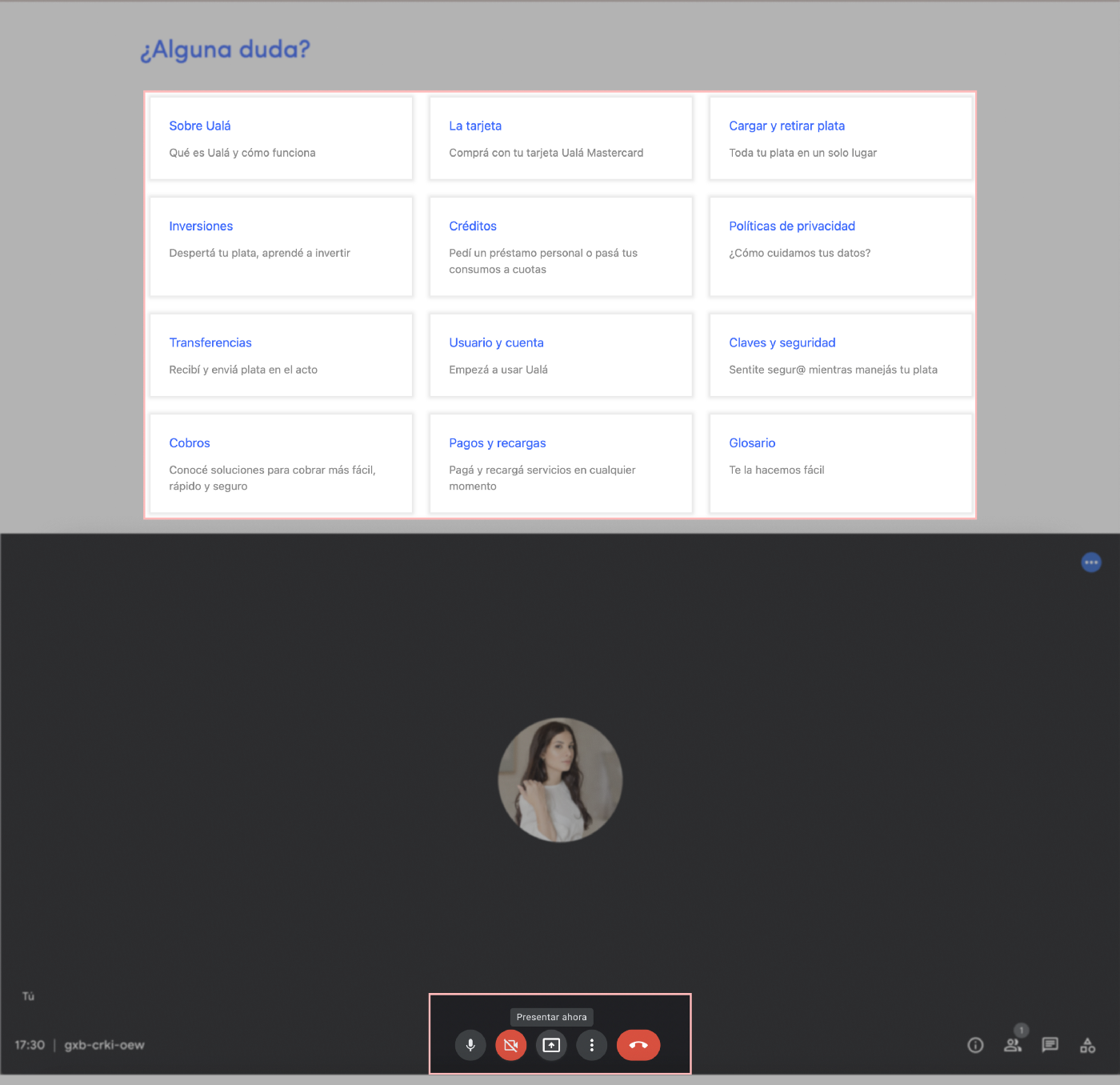
10. Help and documentation
Even in the best scenario where systems can be used without tutorials, it may be necessary to provide help and documentation. This last heuristic signals that information should be easy to search and focused on the user's task. Keep it concise, and list concrete steps that need to be carried out.
There are two ways of providing help:
- In a proactive way when we try to get users familiar with the interface (like when our mouse cursor steps on an element and immediately it shows an explanation that vanishes when we move the cursor.)
- In a reactive way when we try to solve a certain problem. Frequent questions and tutorials are good examples of reactive help. We should not include obvious information, but detailed instructions to help our users find the information they need to complete the task they are trying to accomplish.
I hope these explanations and examples helped you understand the ten UX heuristics according to Jacob Nielsen. Now, you are ready to design intuitive and nice experiences.
If you loved this topic as much as I did, you should visit the NN Group web, whose founders are no other than Donald Norman (author of The Psychology of Everyday Things) and Jakob Nielsen.
I hope you enjoy it! Until the next article! 🚀